Logo design for 2M Builders
The brief
Andrew and Ben from 2M Builders came to us needing help with a logo. They were struggling to bring together something that appealed to their customers, communicated their business approach, and also fit their individual visions of a logo. They needed a logo that could be applied to various collateral such as signs, cars, newsletters, websites and t-shirts.
After our initial meeting with them, we summarised that the logo needed to capture the following things to successfully reflect the business and appeal to South Hobart residents, their target audience:
It needed to feel approachable and trustworthy
It needed to feel clean and modern
It needed a hint of an eco-friendly feel
How did we do this?
Logo design that communicates
After establishing what the logo needs to communicate, we drafted designs to fit this brief by including the following elements:
Experimentation with natural colours, textures and illustrative styles to give an eco-friendly feel
Pairing this with clean lines, modern, rounded fonts and white space to feel modern, clean and high quality without seeming too harsh, traditionally masculine, or unapproachable.
We had two meetings with Ben and Andrew at different stages of the design process, allowing them to see different possibilities for the design and know what it could look like. It can also help reinforce what are the most important aspects the logo needs to express. For Ben and Andrew, this meant finding a middle ground between what they both wanted the logo to look like and communicate. Seeing the various designs of the logo in reality (not theory) meant they could discuss between themselves and us what they liked and didn’t like.
In the meetings, we identified the key features of their business approach and the designs which best suited that, and then looked at the ways we could incorporate their different tastes into the final design.
Deliverables suited to our client
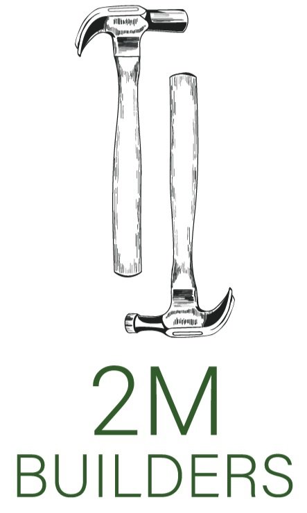
As the logo needed to work with different applications, we decided a vertical design of the logo could also be useful for t-shirts and different layouts. We always want to design logos that actually work for our client, which is why we deliver different logo variations to suit the different applications the business may have. When we hand over a logo we provide both high-resolution and web-resolution image files, for this design we also provided a heavy version, with heavier weighted lines and fonts, and grayscale version of the logo. This made it easier to use for really small prints like newsletters while maintaining the original design for larger prints and signs.
The results
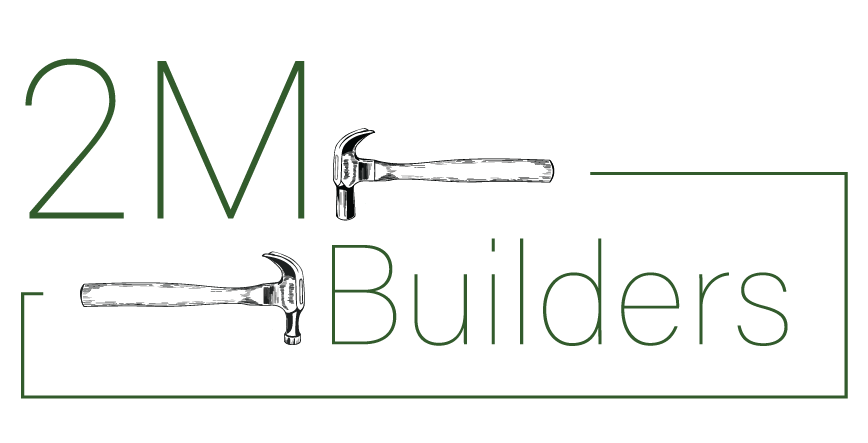
The result is 2 logo variations, vertical and horizontal layout, in colour, black and white, and a heavier weight alternative.
The logo feels clean and modern with a unique illustrative style. The style feels modern but not harsh, angular or aggressive. The colours are black and green with lots of white space, the green is a nod to their nature focussed builds. The logo is suitable for a variety of applications like signs, T-shirts and their website. The final logo is something that works for everyone and suits the business.
Have you seen the 2M Builders logo around Hobart?


